IUAV MADI Workshop
We spent great few days at Venice being invited as lecturer to IUAV University for their Master Digitale program. Here is a recap and some lecture snippets about light and materials.
Master Digitale is an extension of Master Architectural education at IUAV University, or rather 1 year course designed to introduce you into the world of CGI and Visualization. During the second term they invite professionals from industry to give brief workshops to students. We were lucky to be selected among them this year, when their program director Fabio reached to us in January. Coincidentally, they also reached to Ondra Karlik, Main developer and show running guy behind Corona, renderer that we use in production, who would repeat his role for second year in row. So it was rather natural outcome that we decided to partially “merge” our lectures on same days, Friday and Saturday, each time giving 8 hour blocks of lecturing.
The event was sponsored by Rebus guys, who arrived in likeable group, showcasing to students workflow of using their render farm service, extremely easy process turned bit more complicated given less then stellar internet service in the old Palazzo (or whole Venice perhaps).
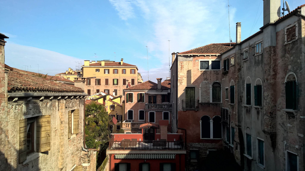
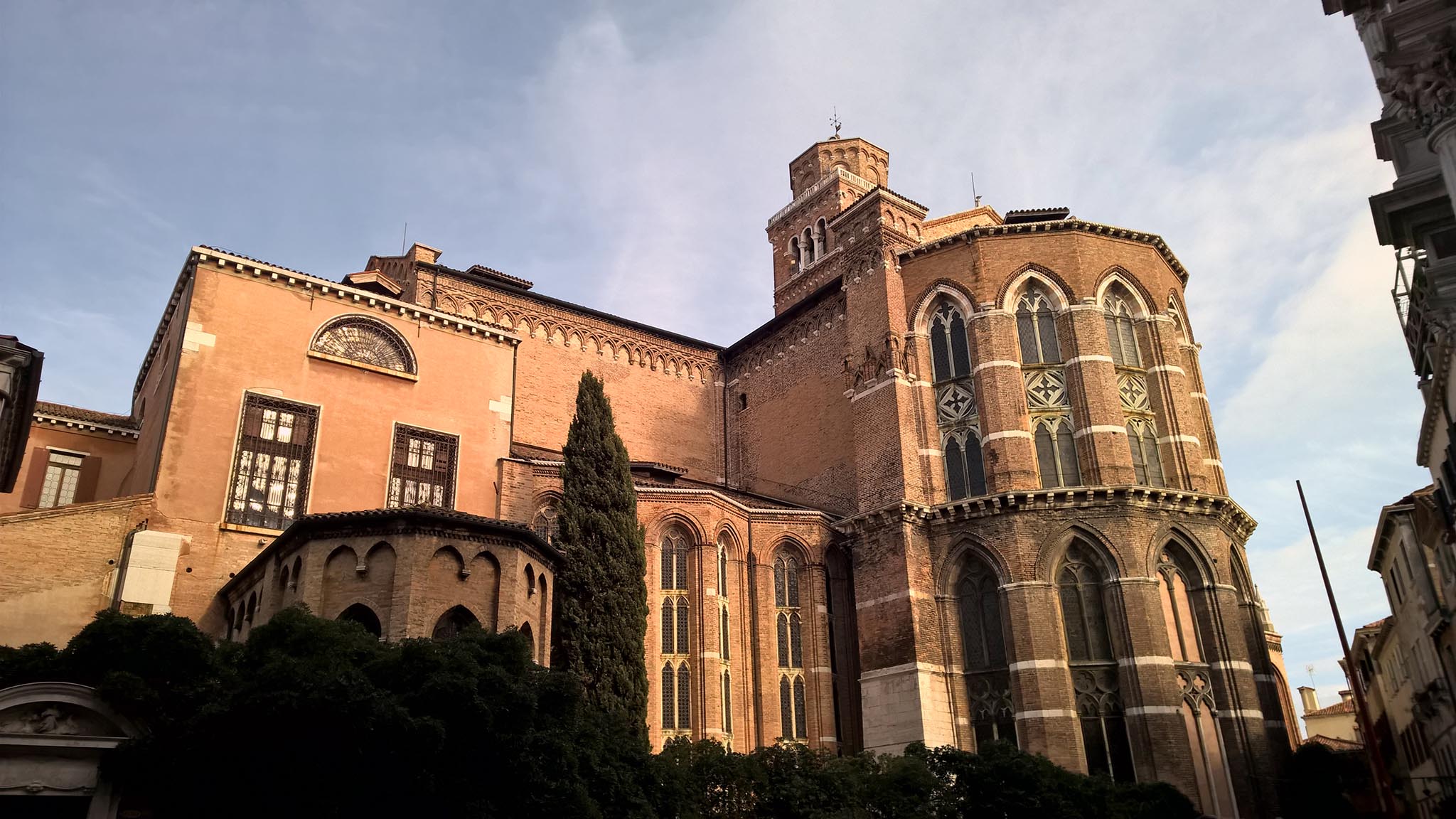
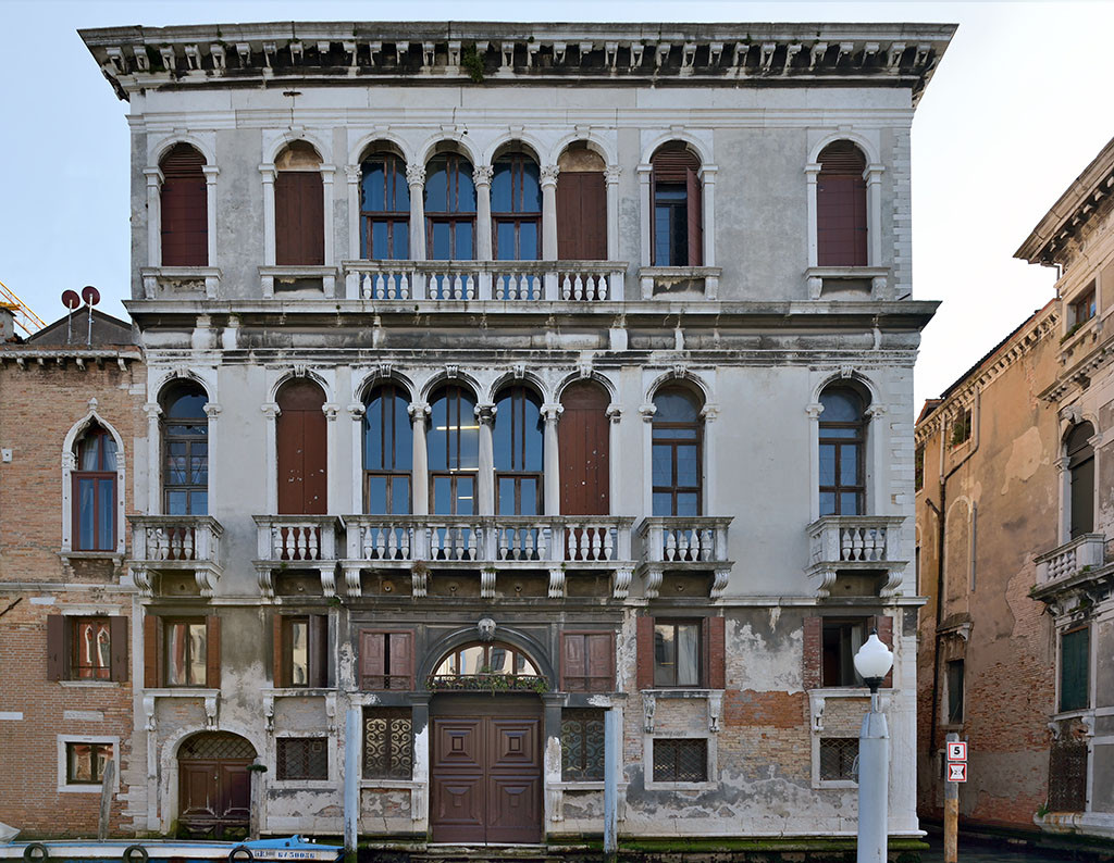
Did I mention the event was held in fantastic historical Palazzo Ca’tron ? Definitely new experience setting up your laptop in centuries old premises, something that’s very close to my liking and heart. Here is a nice view from the canal.
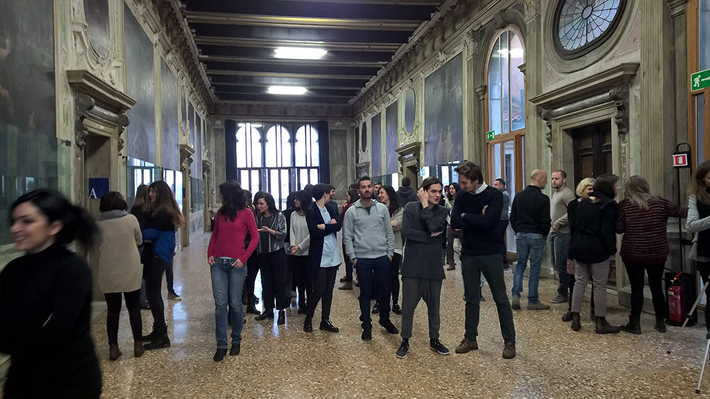
Students gathering for some opening speeches.
Our lecturing was opened by Ondra, who gave students his popular ‘magic usb’ with some basic scene, showing them perhaps how to scatter their first Tree and grass. Or maybe not :- ). Bringing older dual-core macbooks with 4gb of memory might not be the best idea if your plan is to work in CGI.
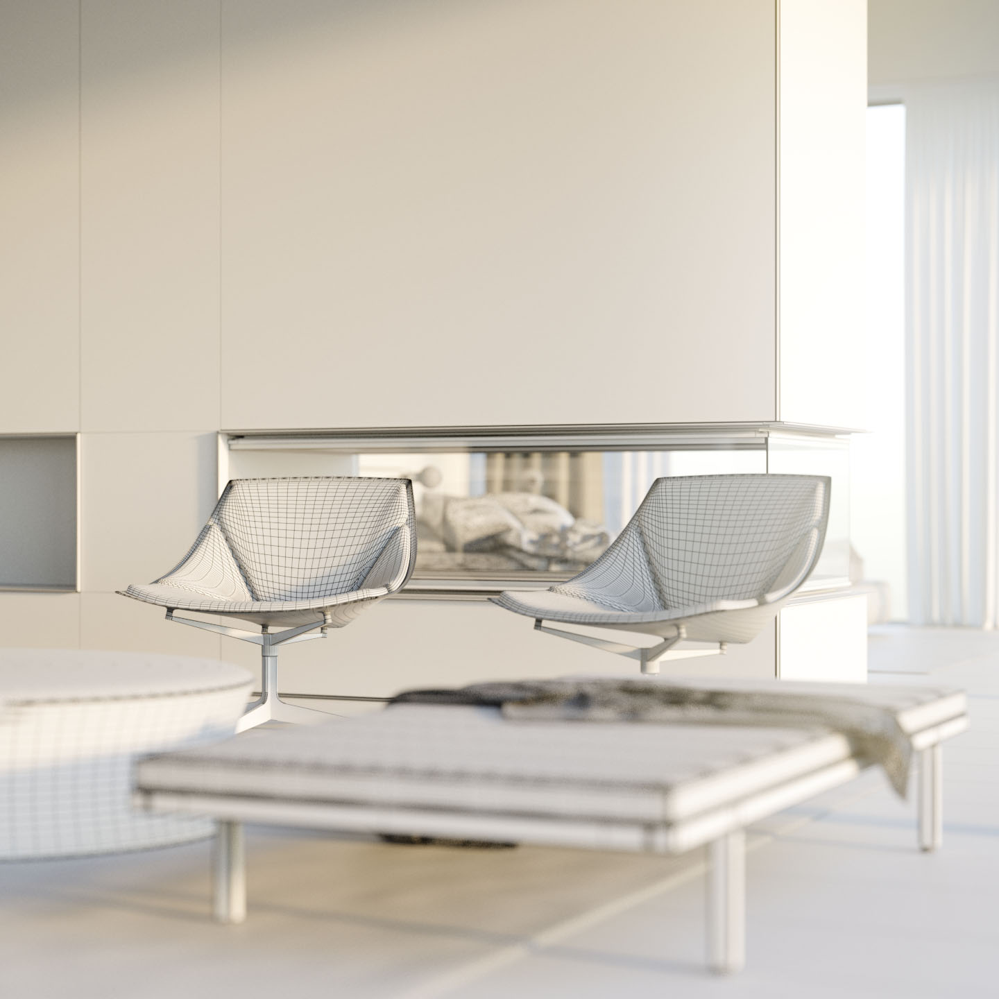
With this brief introduction into working with Corona, I could swap roles and began our hands-on approach to lecturing, which now consists of no crappy powerpoints, and straight into 3dsMax. We prepared a scene that I am rather proud of and plan to use in near future in more ways (everything is modelled by us so we could share it later). Veronika and I spent a week to make something complex yet easy to tackle, although in hindsight we overshot a bit. Note to self, go simple as possible next time.
You can click on images below to see them in large.
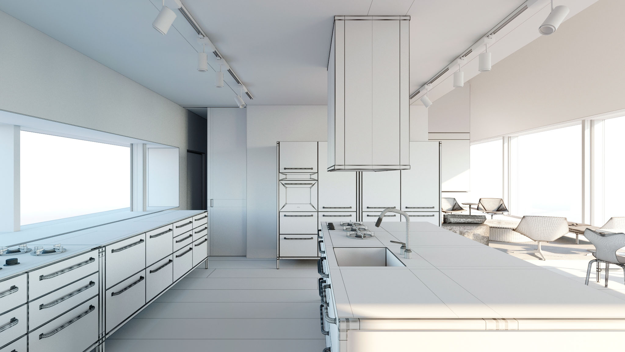
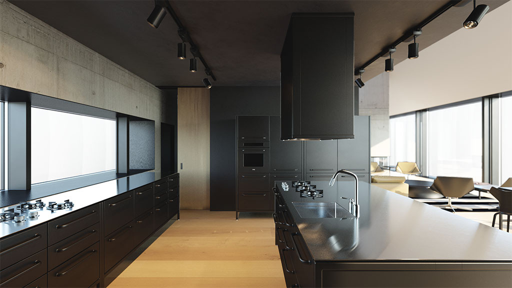
A bit of danish industrial coziness in simple light and neutral-white shader with defining wire.
 A simplest warm sun can often be the best you might need. Setup using some basic technical tweak to Sun&Sky system, but mostly careful creative decision where to place it.
So what did we focus on and how much can you teach in 8 hours ? The utmost basics and I believe a lot. But basics is all we do, in daily production, they’re flexible and scalable and once you know how to use them, it’s only how much time you’re willing to play with them to get the best out of it. It will move your from technical role into role of photographer, instead of focusing on crusade for holy grail of some imaginary numbers, it will be up to your perception and taste to position light to make your image look good, and choose color palette that compliments your scene instead of pondering endlessly if there’s some secret button that could be checked.
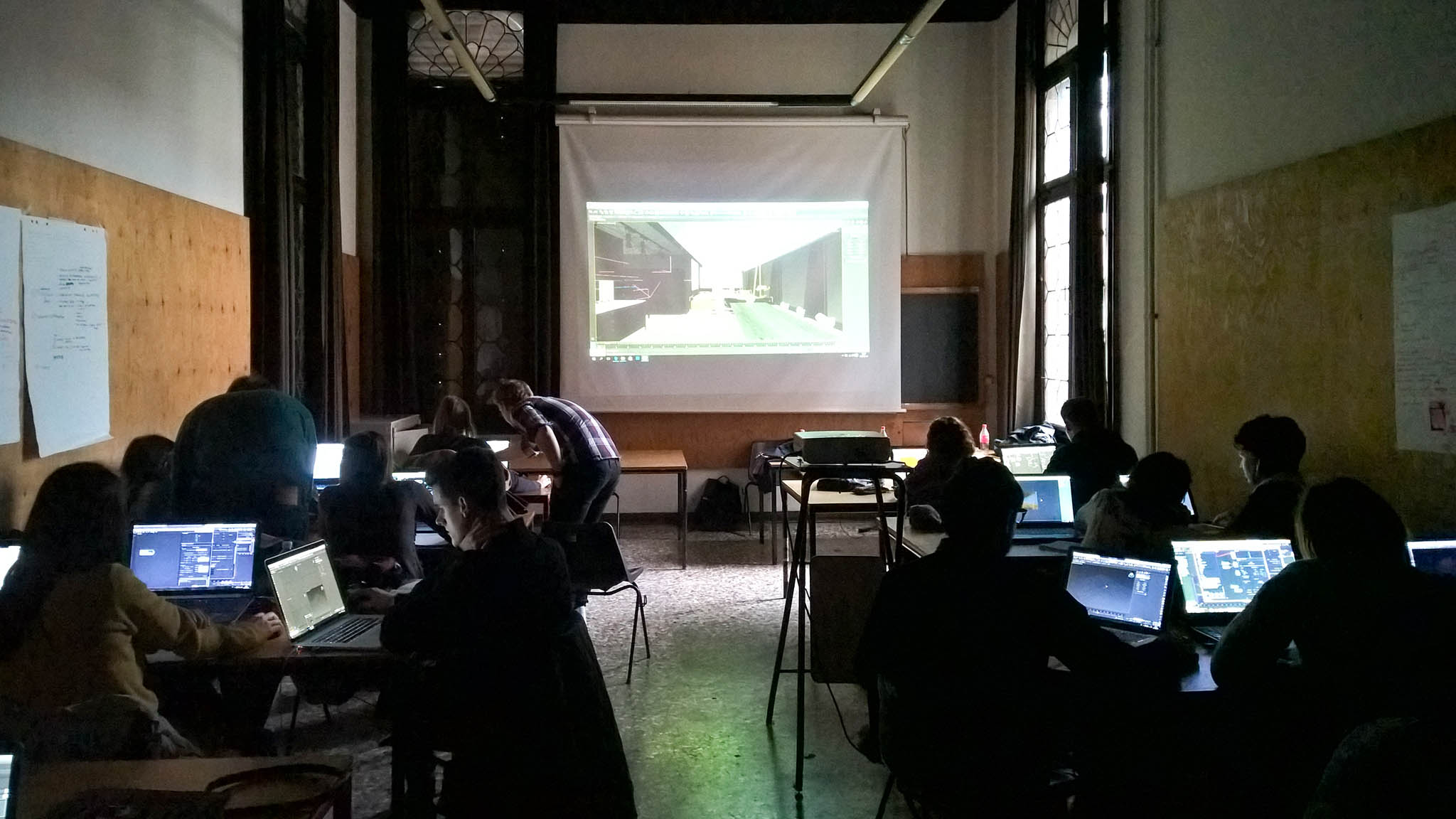
Class A, Day 1. This was pretty good group of students.
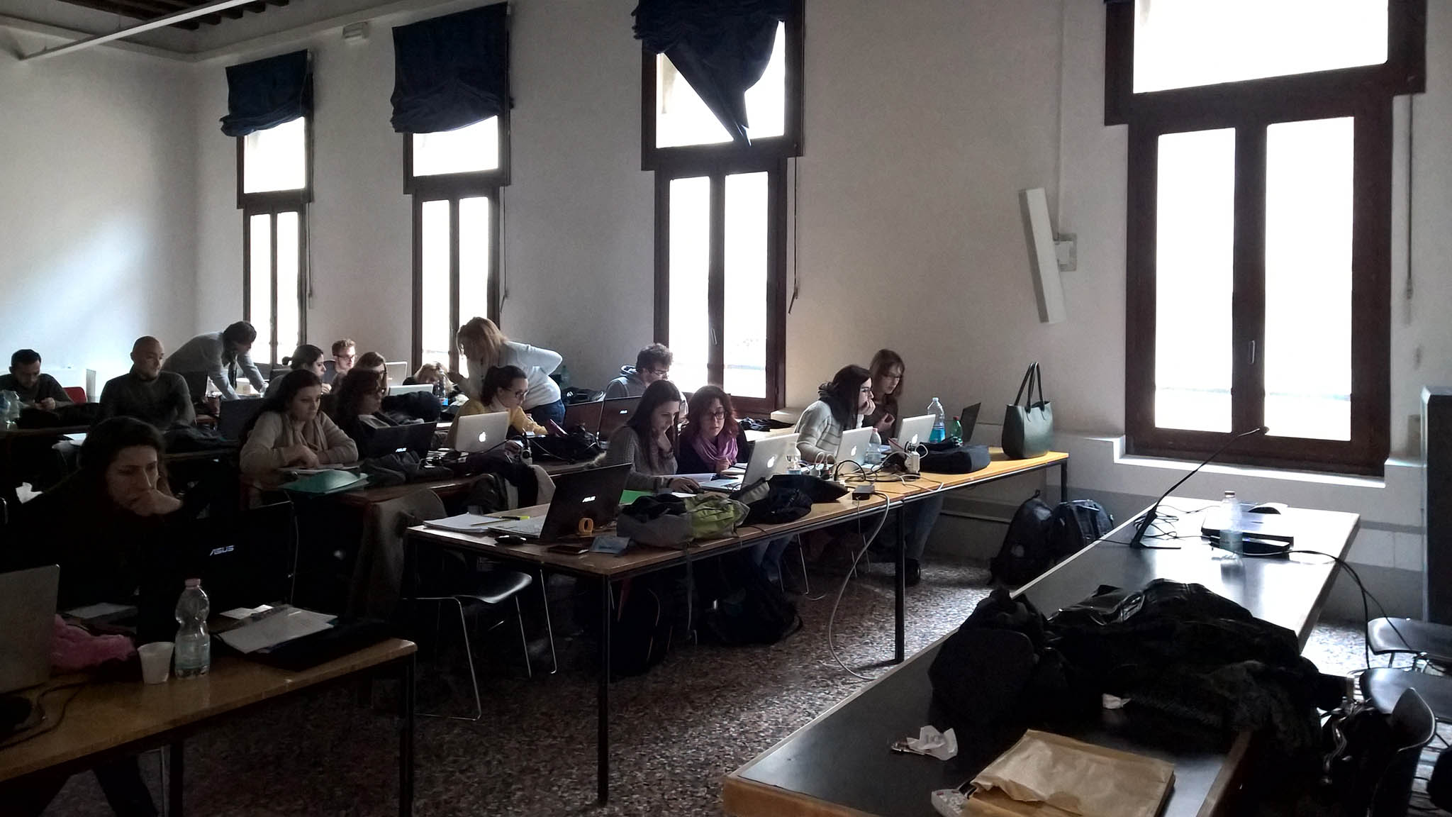
Class B, Day 2.
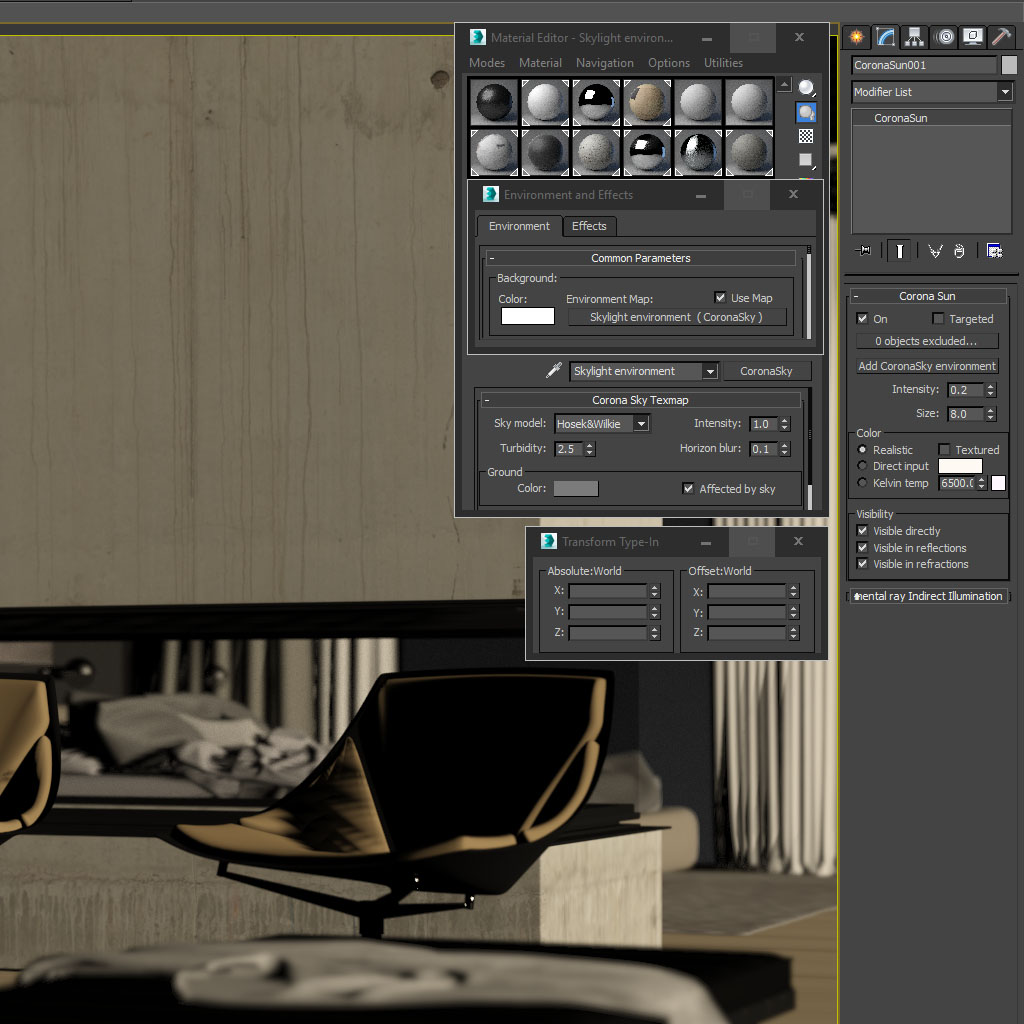
Light is the single most important part that defines how architecture looks to me. It works that way in photography and likewise in visualization. Materials, composition, story are all important aspects but without light it would be nothing and even poorly executed image with interesting light can spark interest. I had shown the setup of the most common used lights and scenarios in which they’re used. Corona Sun&Sky, HDRi Environment and artificial IES fixtures. The ones you can grasp without requiring their technical understanding and minutiae.
Let’s look at some Sun setup we played with. There really are only few controls that matter, and pretty much none of them are technical, these are all creative choices. From the moment you place Sun&Sky in your scene, the light is physically correct and will render realistic result depending on state of your scene, but that doesn’t necessarily mean it will be a nice image. And going from “ok, it looks like there is light” to “looks very nice” doesn’t involve any secret knowledge about exact numbers, setting or buttons. So all the parameters we used was how sun and sky color reacts to changes of angle in default ‘realistic’ mode and using intensity to modulate the ratio between direct sunlight and indirect skylight contribution which affects the prominence of shadows and color contrast, and lastly Size, affecting the softness of shadows. In this particular screenshot you can see the sun is less intense for sunset feeling but bigger to produce very soft shadows.
The Sky is left untouched (this is default state), although I occasionally tweak the Ground color (when there is no 3D environment behind windows) and Affected by Sky checkbox where I want to decouple Ground color from color cast. This can create interesting, bit artificial studio-like setup for interiors where bounced light from ground on ceiling is much colder despite sun reaching very warm tones.
Which would produce the following images straight from the framebuffer (I am using VFB+ plugin if the bloom looks suspicious to you, more on that later).

After this we jumped right into the most common use of HDRi, the blues dusk Sky and artificial light. To avoid this blogpost being far too wordy (which it already probably is by now), and leave this rather interesting section for more in-depth tutorial, let’s look at some materials we got to create. They’re the most basic version of common architectural materials, to not confuse beginners with head-spinning shader networks and instead instill the natural behavior for diverse materials and the difference between them such as metals (conductors) and non-metals (dielectric), which fundamentally differ to how they treat light (diffuse reflection vs specular reflection).
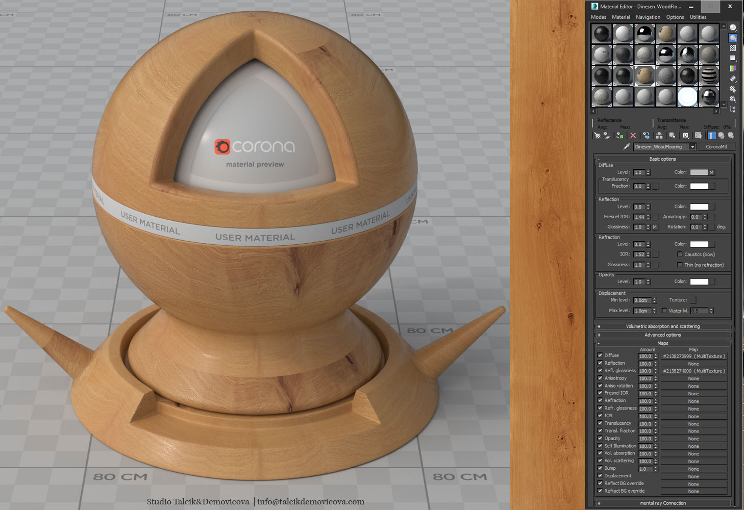
The common bunch: Wooden floor (Dinesen), White paint, Dark paint, Cotton fabric, Felt fabric, Leather, Scratched Aluminium, Concrete, Steel. Simple, or rather crude, something to get out of the door in 5 minutes, so you can see how your scene looks in color. No fine-tuning or playing around. Just set the rules, full grazing specular, IOR for dielectric, ComplexFresnel or averaged color in specular slot for metals with no diffuse component.
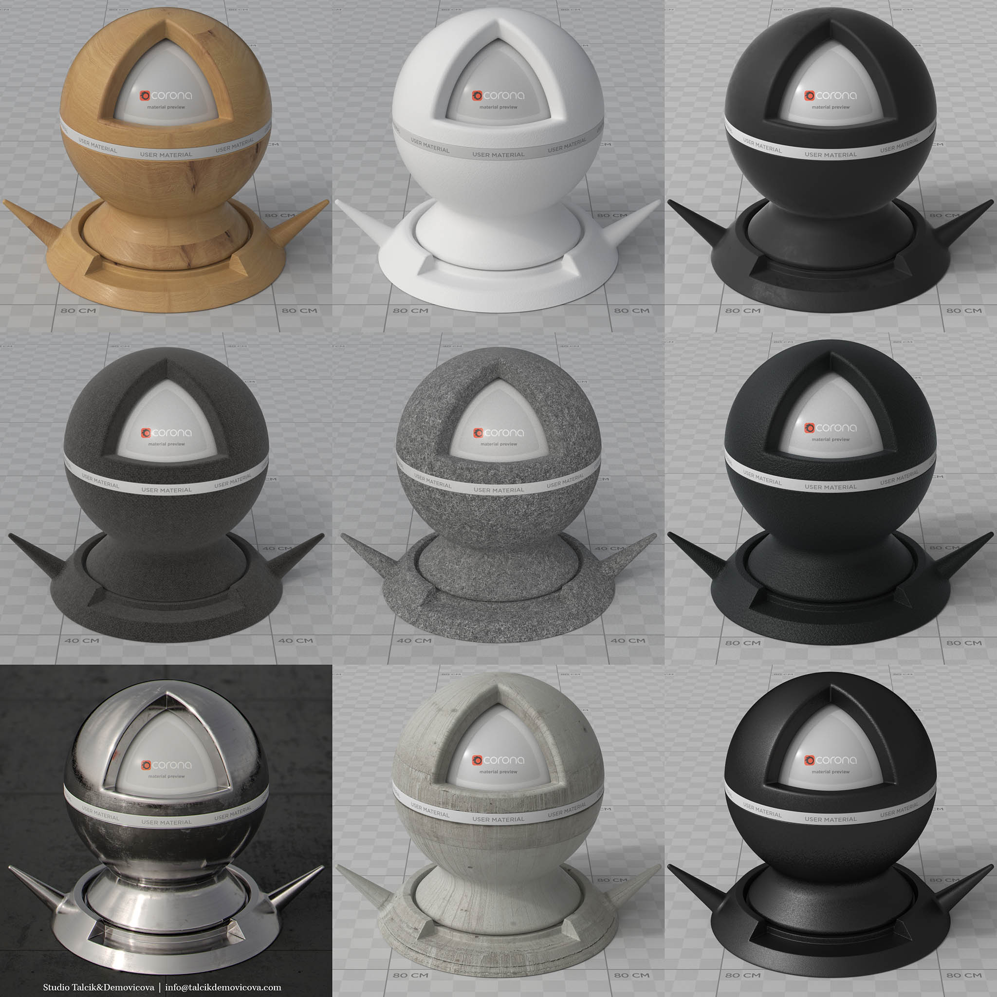
Nothing just diffuse and it’s variation in glossiness slot. If you wondering why 0.8/1.44 and not 1.0/1.52 well, Corona currently doesn’t have correct glossiness range but it should be in next build.
And did you know Dinesen has textures on its website… ? Well it does (they require some love though).
And showing some usefulness of categorization for future reuse (Outside of pretty good starter pack of materials), using Siger’s CMPP.

So that would be it and with last view from windows of our hotel ( We get easily used to this type travelling although lecturing is rather draining) we left Venice until the time comes again (Bienalle and SOA AD7 ) in October. Ciao !